Burn up vs burn down chart
TweetShould you use burn up or burn down charts for your project? The answer is that it depends on what you are trying to achieve.
A brief overview
Burn down and burn up charts are two types of charts that project managers use to track and communicate the progress of their projects. A burn down chart shows how much work is remaining to be done in the project, whereas a burn up shows how much work has been completed, and the total amount of work. These charts are particularly widely used in Agile and scrum software project management.
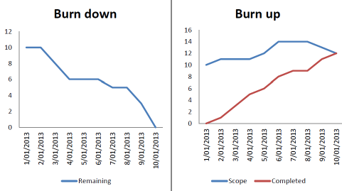
A burn down and burn up chart of the same project. In the burn down chart it appears that the team did not accomplish much in the middle of the project but heroically finished everything at the end. The burn up chart shows the complete picture - that the scope increased at the beginning of the project, and some scope was removed to finish the project by the deadline, whilst the team made steady progress through the entire duration of the project.
Your goal
The primary determinant in whether to use a burn up or burn down chart is what you are trying to accomplish, your goal. Are you presenting to clients for the continued survival of the project? Are you trying to motivate your project team? Are you simply trying to increase your own knowledge and understanding of what is happening in the project? The answers to these questions will determine which chart to use.
Simplicity vs information
burn down charts are simple. A single line racing towards zero as the project is completed. Anyone can understand this chart, and it does not need an explanation. However it can hide important information, for example the effects of scope change.
Scope change is when work is added to or removed from a project. We are all familiar with scope change, the client suddenly demands extra features, or work is removed from a project to meet a deadline. A burndown chart does not show this information as clearly as a burn up chart.
A burn up tracks completed work and total work with two separate lines, unlike a burn down chart which combines them into a single line. The total work line communicates important information - is the project not yet complete because work is slow to be done, or too much new work is being added. This information can be crucial in diagnosing and rectifying problems with a project.
Presenting project progress on a regular basis
If you are presenting project progress to the same audience on a regular basis, for example weekly customer progress meetings, you are probably better off with a burn up. It will allow you to easily show them you are making progress, even if they have been adding more work, or testing has revealed problems that are adding work to the project.
Convincing customers to stabilize project scope
Scope creep is the enemy of every software project. In the face of scope creep burn down charts start to look like little progress is being made. However a burn up clearly makes the scope creep problem visible to the customer. This may even help you to convince them to stop requesting changes and allow the project to complete.
Fixed scope projects
There are certain limited circumstances in which a project may have a well defined fixed scope. If a project is guaranteed to have fixed scope, the burn up chart communicates no more information than a burn down chart, so the simplicity of the burn down chart is preferable.
Intelligent Reports for JIRA can automatically insert burndown charts into professional reports created from almost any aspect of your JIRA data. Intelligent Reports is the easy customizable reporting solution for JIRA, giving you complete knowledge of what is happening in your engineering team. In minutes you could have customized progress reports, timesheet reports, SLA reports and more delivered automatically to your email inbox. So if you use JIRA, what are you waiting for? Get a free 30 day trial from the Atlassian Marketplace today.
This article is part of a series on project progress charts. Articles in this series:
Tweet