Adding a calculated chart to your report
Calculated charts allow you to use Intelligent Reports calculations to fill in the data for your chart. The simplest way to understand the calculated charts is to remember that you are specifying the rows and columns in the spreadsheet for your chart. Microsoft Word then interprets this data to draw the chart.
You can follow these steps to add a calculated chart to your report:
-
Insert any type of chart into your Microsoft Word report template and use Microsoft Word to format it as required. Don't worry about the data values as these will be filled in by Intelligent reports.
-
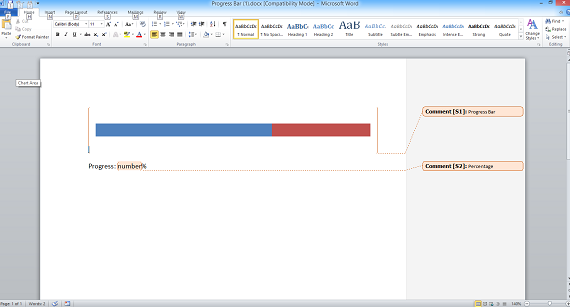
Once you are happy with the look of your chart, add a comment to create a placeholder that covers your chart.

This example shows a bar chart which we will use to display a progress bar. You can use a comment to cover any type of chart which can then be used to create a calculated chart.
-
Upload your template file into Intelligent Reports.
-
Create a new rule to fill in the chart.
-
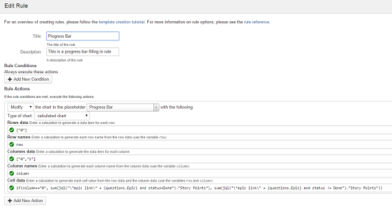
Select Modify from the list of actions and select the placeholder covering your chart. Select calculated chart as the type of chart.

The above rule is filling in a progress bar using a calculated chart. You can use calculated charts with many other types of charts available in Microsoft Word.
There are five calculations required for a calculated chart modify action:
-
Row data
This calculation should return a list of objects which are the data for each row. For example this could be a list of dates:listMonthsBetween(now().addMonths(-6).startOfMonth(), now()) -
Row name
This calculation should return the actual text which is the name of each row. The variablerowholds the row data item for the current row, you should write a calculation to return the name of the row to put in the spreadsheet. For example, if the row data is a list of dates, you should format the dates in your required date format:row.format("dd MMMM YYYY") -
Column data
This calculation should return a list of objects which are the data for each column. For example this could be a list of all projects:all.projects -
Column name
This calculation should return the actual text which is the name of each column. The variablecolumnholds the column data item for the current row, you should write a calculation to return the name of the column to put in the spreadsheet. For example, if the column data is a list of projects, you could return the project name:column.name -
Cell data
This calculation should return the value to put in each cell of the spreadsheet. The variablesrowandcolumnhold the row and column data for the current cell. You should write a calculation to take the current row and column and return the value to put in the cell. For example, if the row data is a list of dates and the column data is a list of projects, you could write a calculation to determine how many issues were created in that project in that month:count(jql("project = {column} and created >= {row.startOfMonth()} and created <= {row.endOfMonth()}"))
You can click here to learn more about calculations.