Adding a count based chart to your report
Count based charts are ideal for comparison type charts such as pie or doughnut charts. Count based charts can be used to fill in the column names and data for charts with a single data series.
You can follow these steps to add a count based chart to your report:
-
Insert a pie or doughnut chart into your Microsoft Word report template and use Microsoft Word to format it as required. Don't worry about the data values as these will be filled in by Intelligent reports.
-
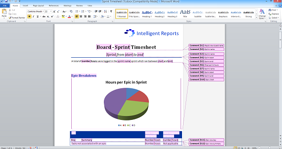
Once you are happy with the look of your chart, add a comment to create a placeholder that covers your chart.

This example shows a pie chart which displays the hours in each epic for the chosen sprint. The comment creating a placehoder called "Epic chart" covers the entire chart.
-
Upload your template file into Intelligent Reports.
-
Create a new rule to fill in the chart.
-
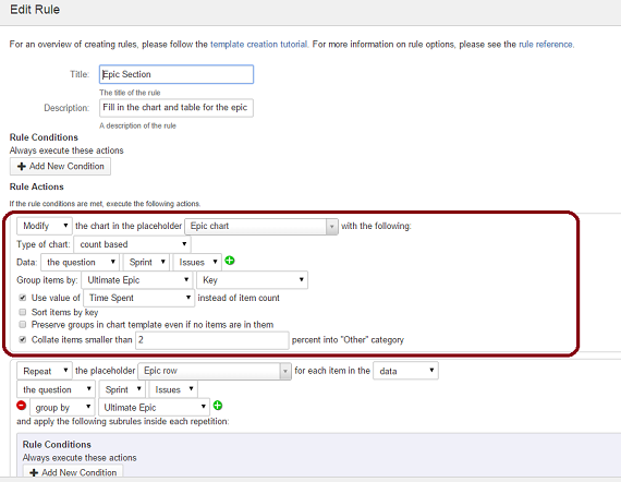
Select Modify from the list of actions and select the placeholder covering your chart. Select count based as the type of chart.

The above rule is filling in a pie chart specified by the placeholder called "Epic chart".
The modify count based chart action asks you to select a list of JIRA objects using a data select component. It then asks you to group these objects by some attribute of the object, for example assignee name, or project name.
The chart in the document will be filled in with the object attribute as the row name, and the number of objects with that attribute as the data. For example, if you select all issues in a particular project, and group by assignee name, your pie chart will be filled in with the number of issues assigned to each assignee.
There are four further options for count based charts:
-
Use value
This option allows you to use the total of a value field of the items as the data instead of the count of items themselves. For example, you could use the value of the estimate field on a chart of the list of issues grouped by assignee name to see the estimated length assigned to each person from those issues. -
Sort items by key
This option allows you to sort items alphabetically by key instead of the default which is to sort by largest value. This will allow you for instance to list people in alphabetical order instead of by who has the most issues assigned to them. -
Preserve groups in chart template even if no items are in them
This option allows you to specify groups which must be included in the chart even if they have no items in them. For example you could ensure all priorities are represented in a chart of priorities of issues reported in the last week, even if no issues of that priority were reported. In addition the priorities would always be in the same order, so the priorities would be represented by the same colors in each report. To use this option, insert the group names in the appropriate cells in the data spreadsheet for the chart in your Microsoft Word template file. These names will be left in the generated report in their existing order. Any groups not already listed in the chart will be inserted after the existing items, sorted by value (unless the sort by key option is selected). -
Collate
This option allows you to combine all items smaller than some threshold value (eg. 2%) into a single "other" category. This is useful to cut down the number of items shown in the pie chart to a manageable level, for example if you had 100 customers request support, but most only requested a small issue, you might collate the small ones into an other category so that you can clearly see the customers which have consumed a lot of support resources.